05 Apr Best Practices for Building an Effective Landing Page
A check of your website’s analytics will tell you what marketers have known for years. The majority of visitors are now connecting to the internet with mobile devices. Depending on the demographics of your market, as much as 90% of your traffic is viewing your pages on cell phones. Even older users have embraced technology. Nearly half of adults in the U.S. aged 65 and older own smartphones. Google’s search algorithm prioritizes mobile responsiveness when serving up search results, putting pages that are not mobile-friendly at a disadvantage.
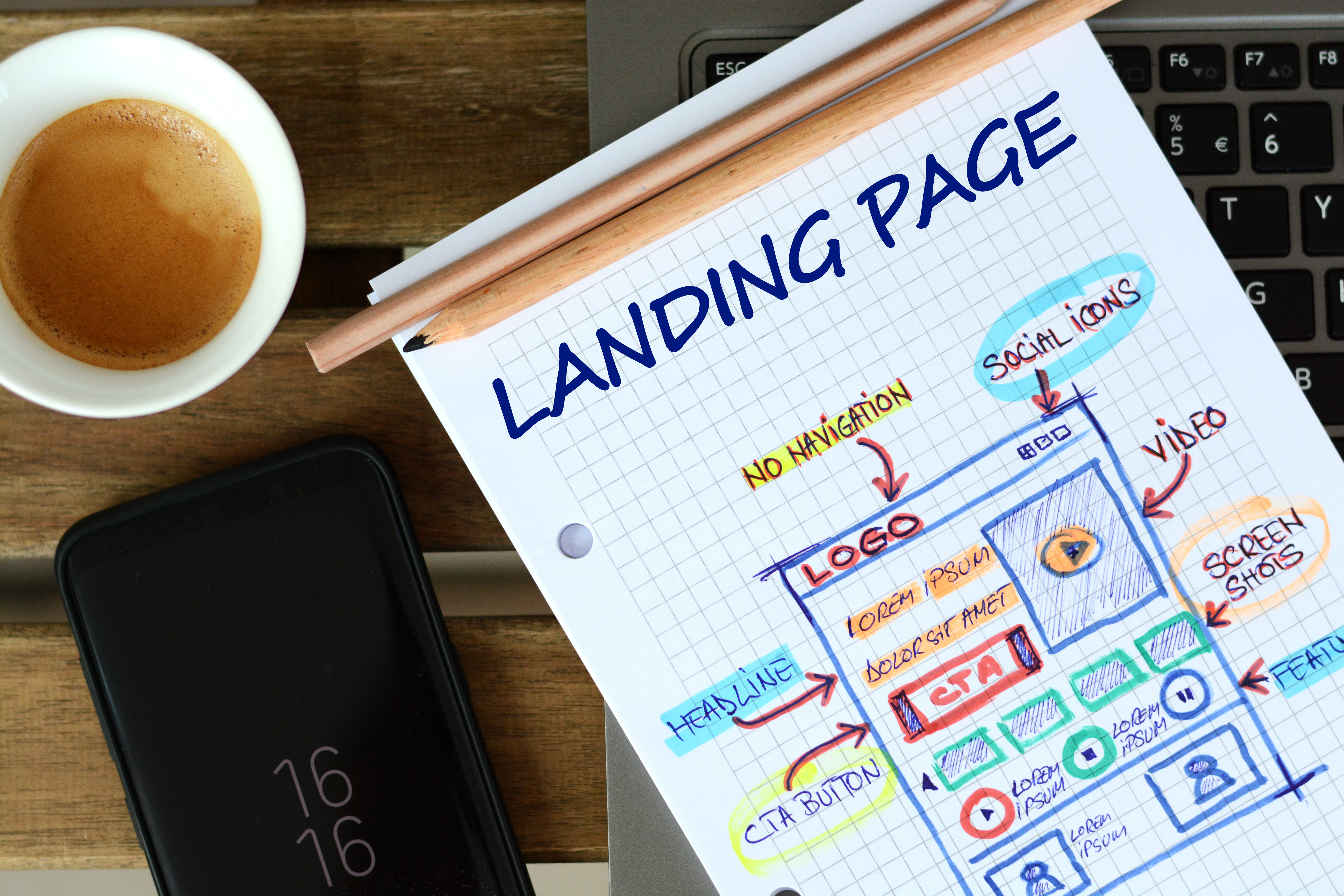
Your landing pages each have a specific purpose. You may be building an email list, generating leads for a new product line or promoting a loss leader to build your customer base. To maximize conversions, your page must be easy to read and offer a clear benefit. It has to load quickly while being visually attractive. The CTA must be placed where it can’t be missed and large enough that following the link is possible from a small screen.
There is considerable variation in screen resolutions across mobile devices. For the best user experience, it is worth the effort to identify the devices that are most popular with your target audience and optimize your landing pages to work smoothly for these users. Follow these content and formatting recommendations to build mobile-friendly landing pages that will drive conversions.
Clearly State the Page Purpose in the Headline
Users should know immediately why they are reading the page. This is not the place for vague wording. Give visitors a reason to continue reading. Include an action word (verb) in the headline — “Download the latest…”, “See how much you can save …” State your offer and its benefits.
Use Concise Language
Don’t waste space on clichés and trite phrases. In three sentences or less, pitch your offer. Use another three sentences to describe the benefits users will experience by taking the requested action, your CTA. If your product requires more description (for example, you need to explain the reason why your high-end product is more expensive than a competitor’s), break the text up into short, readable paragraphs. It is difficult to read long blocks of text on a cell phone.
Users will scroll down if the content is useful to them, however, studies show that the majority of viewing time is spent above the fold, making it important to cover the major thrust of a page in the first two paragraphs.
Format Page for Mobile
Use a single-column layout. Horizontal columns and sidebars will automatically be stacked at the bottom of the page and users may not scroll that far down. While users have the option of zooming in on text, most will not want to be bothered. Use a large font size — 16px for paragraphs is standard with proportional adjustments to H1 and H2 tags — to avoid frustrating visitors. Re-size images so they will load quickly and remove distractions such a menus and navigation bars. Improve UI by leaving white spaces around elements. A landing page should have a singular purpose. Eliminate anything not essential to that purpose.
Call-to-Action should be Obvious and Easy to Answer
Users should know exactly what you are asking them to do, and it should be easy for them to do this. CTA buttons should be large and in a contrasting color so they will not be missed. Although they often are located at the bottom of a page, if the page is long, introducing the CTA at a mid-point will better drive conversions.
The CTA button text must be specific — “Click here to download,” or “Register now.” Don’t demand too much from your visitors. A form with multiple fields may drive prospects away. Forms are not always easy to complete on mobile devices and consumers are leery when it comes to handing over personal information. If you would like to learn more about your prospects’ needs and interests, use a landing page to collect an email address and continue interactions with an email campaign.
Test Page Variations
Simple changes to text and elements, such as using the word “cost” instead of “price” or a blue CTA button rather than a red button, can have a dramatic effect on conversion rates. Use A/B testing to discover what works best with your target market.
Consumers have come to expect quick-loading, responsive designs. They will not have patience with pages that are difficult to understand or navigate. You only have a few seconds to grab their attention and not much more time to hold it and convince them they want to respond to your CTA. In today’s hyper-connected environment, marketers must assume their prospects are using mobile devices and develop campaign materials with a mobile-first approach.